Supermarket Zona Sul
2021
Summary
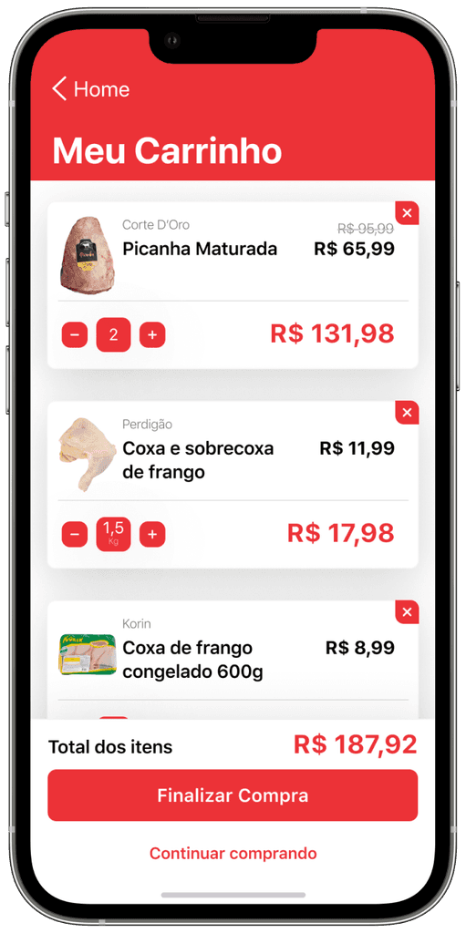
When Rio's beloved Zona Sul supermarket needed a digital facelift, our MBA team stepped up to the challenge. Recognizing that it wasn’t just about a dated design but a complete user experience overhaul, we dived deep into the heart of the app's issues. My role? Steering the ship for user flow planning and spearheading the app's redesign. It was all about blending modern UX principles with the unique vibe of Rio to revive an app that truly resonates with Zona Sul's loyal customers.
Discovery
Our journey with the Zona Sul app began with a crucial discovery phase. Here, we focused on understanding the users and the market. Through surveys and user interviews, we gathered insights about what Zona Sul shoppers really needed from the app. We also analyzed competing apps to identify industry standards and areas for improvement. This phase was all about laying a solid foundation for our redesign, ensuring it would not only look good but also meet the real needs of its users.
Here's what we found
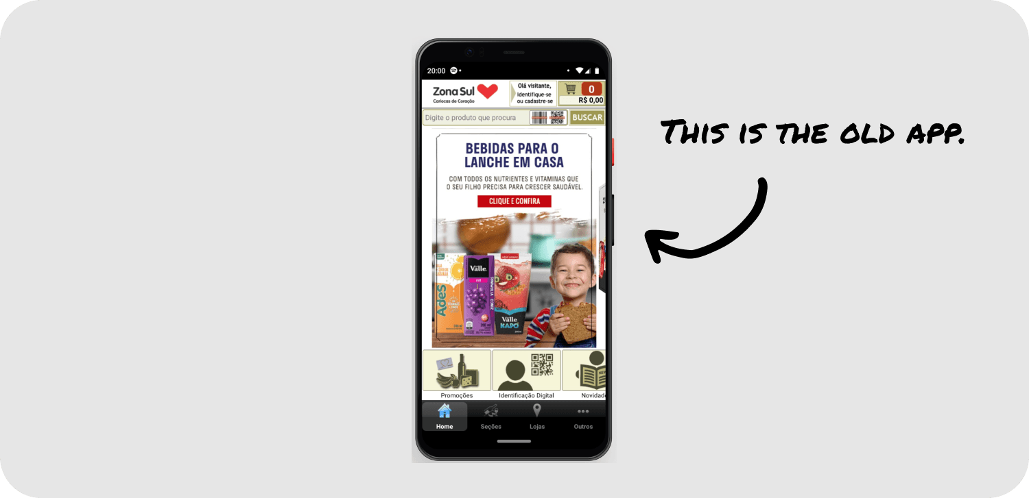
In our exploration, several key issues with the Zona Sul app surfaced. Primarily, users faced navigation challenges, with many finding the app’s layout unintuitive and cumbersome. There was also a noticeable lack of features that modern shoppers expect, such as personalized recommendations and an efficient checkout process. The design felt outdated, not reflecting the vibrant and dynamic spirit of Rio’s shoppers. These findings formed the bedrock of our redesign strategy, clearly outlining what needed change to enhance the user experience.
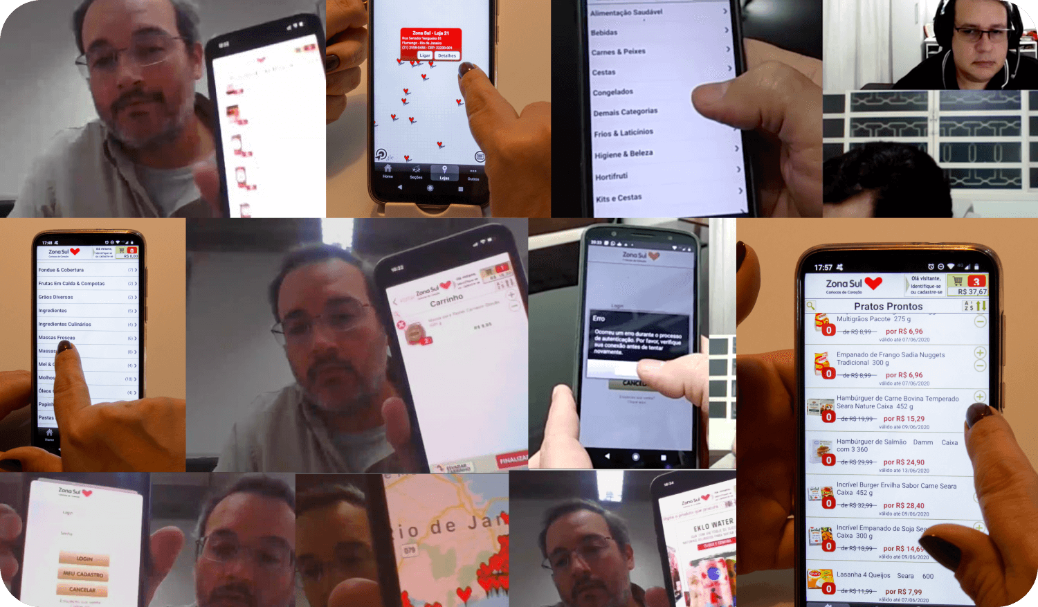
To validate our findings, we conducted usability tests with real Zona Sul customers. This hands-on approach provided us with invaluable feedback. We observed users interacting with the app, which highlighted areas where they struggled the most - particularly in product search and navigation. Many users expressed a desire for a more engaging and interactive shopping experience. These real-world insights were eye-opening, giving us a clear direction for the redesign and ensuring that our solutions were not just theoretical, but truly user-driven.
A fresh start
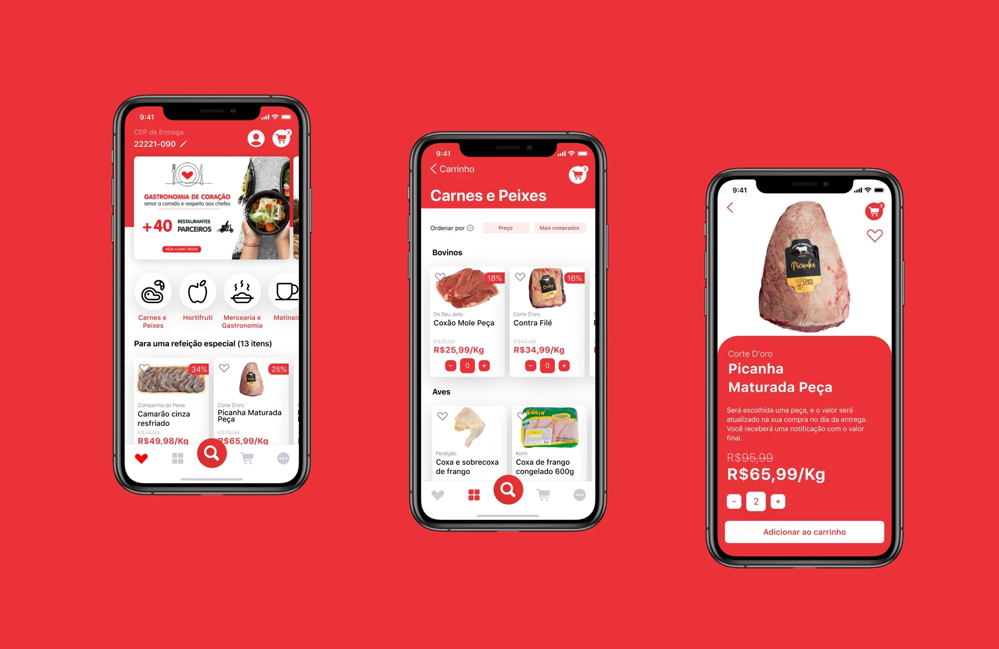
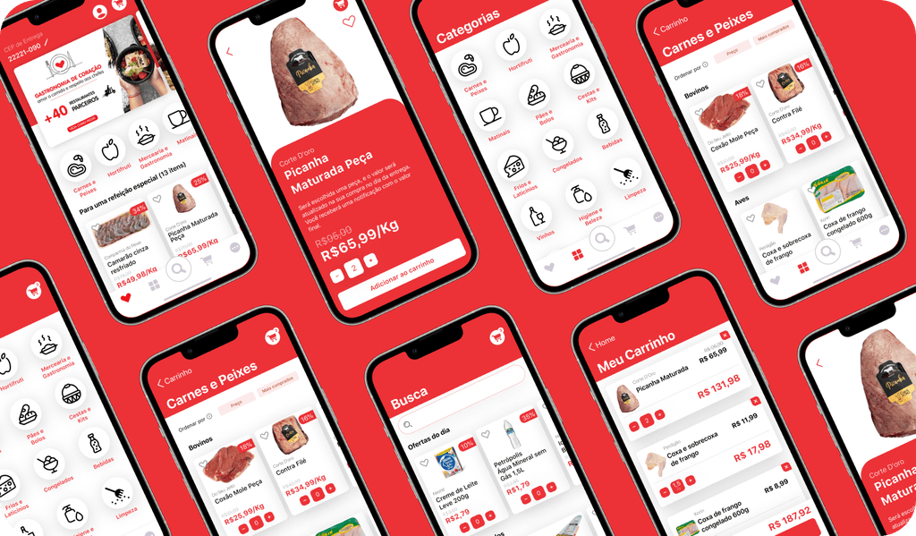
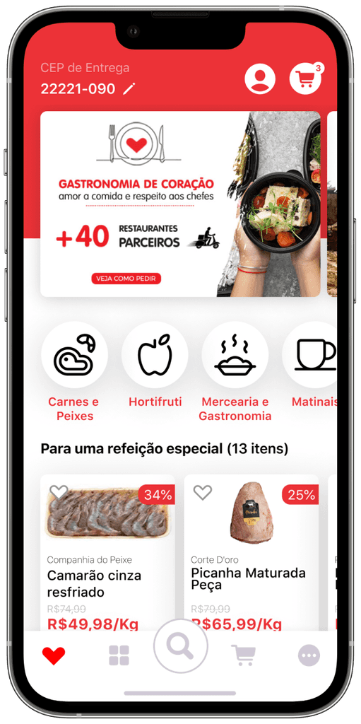
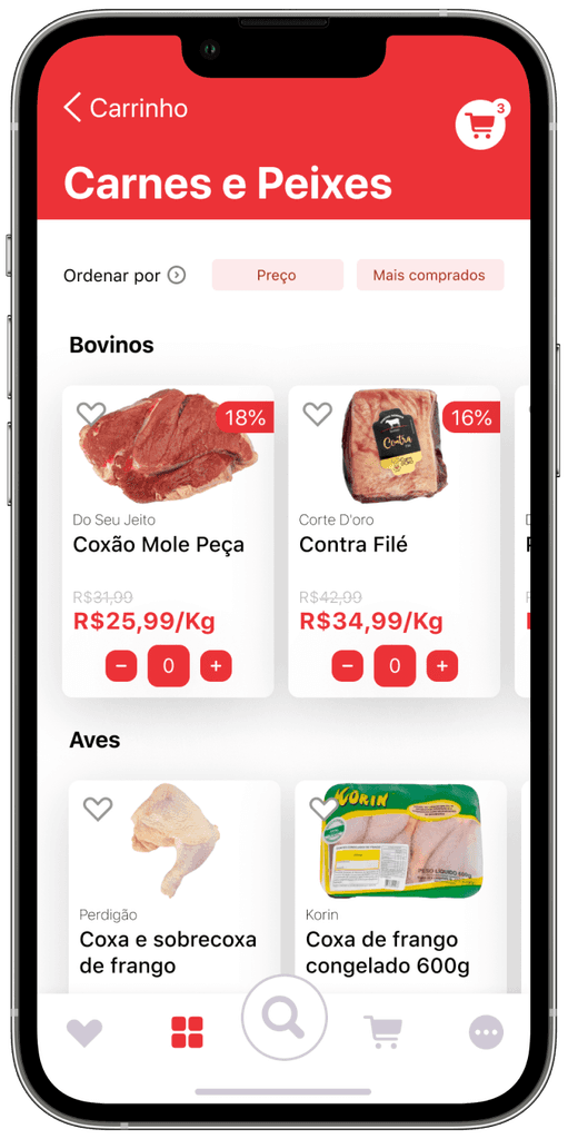
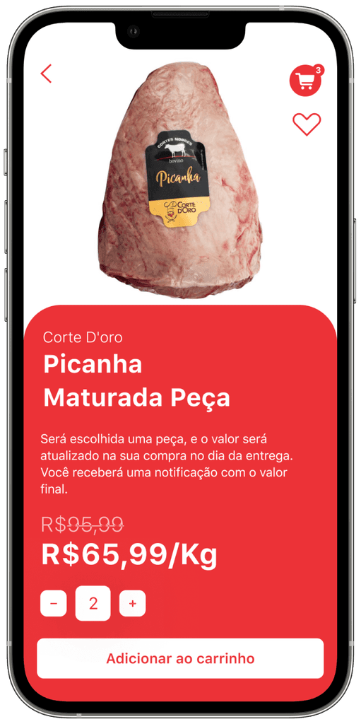
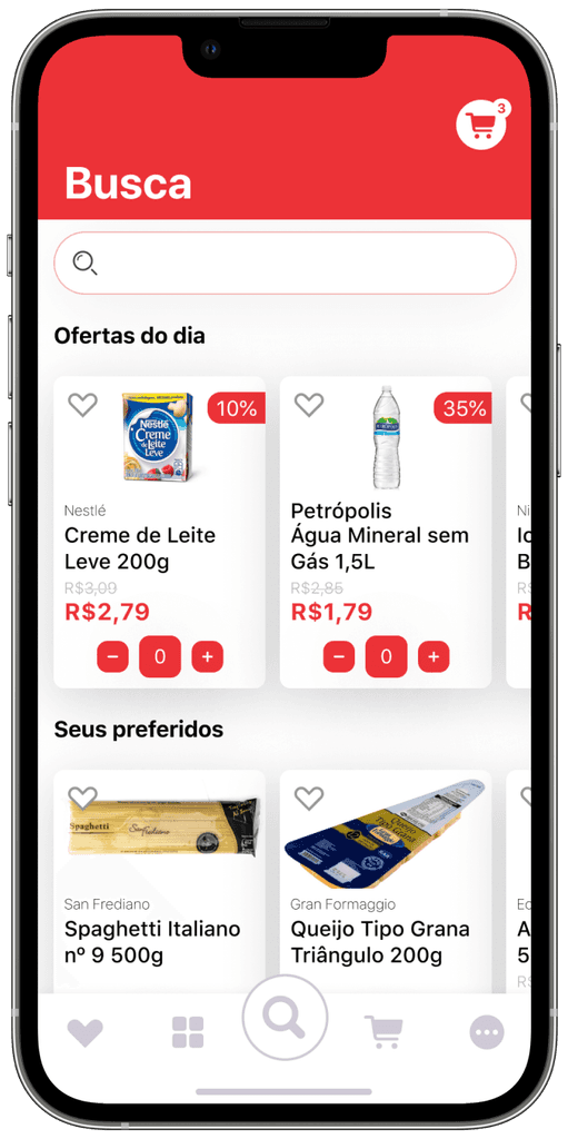
Envisioning a new era for the Zona Sul app, we embraced a design philosophy that combined aesthetics with functionality. Our goal was to infuse the app with a fresh, modern look that still felt distinctly 'Rio.' We prioritized a clean, user-friendly interface that would resonate with the vibrant energy of the city and its people.
Our redesign strategy was multi-faceted. We proposed an intuitive navigation system, making it easier for users to find what they need with minimal effort. Personalization features were introduced, including customized product recommendations and a more streamlined checkout process.
We also planned to integrate interactive elements, such as a virtual shopping assistant, to make the shopping experience more engaging. Each proposed improvement was aimed at not just updating the app, but transforming it into a tool that would enhance the overall shopping experience at Zona Sul.
Conclusion
As we concluded our MBA project on the Zona Sul Market app, the experience transcended academic exercise and ventured into real-world impact. This journey wasn't just about redesigning an app; it was about deeply understanding user needs and translating them into tangible, innovative solutions. It reinforced the immense potential and responsibility of user-centered design in shaping everyday digital experiences.
