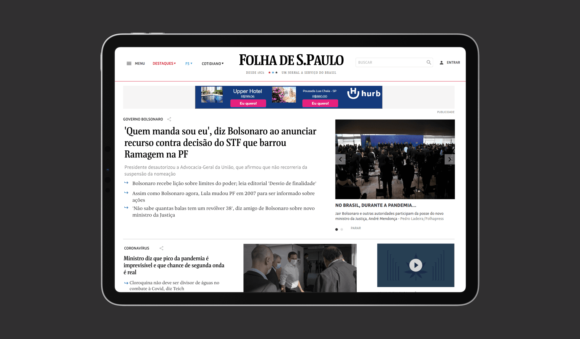
Folha de São Paulo
2019
Overview
In my Information Design class during my UX Design MBA, I collaborated with my teammate, Willer Goulart, on a project to redesign the website of one of Brazil's major newspapers, Folha de São Paulo. Our objective was to analyze the current layout and information design of the website, identify areas for improvement, and propose a user-friendly redesign. While the project was a joint effort, the design work was primarily my responsibility.
Here's what we found
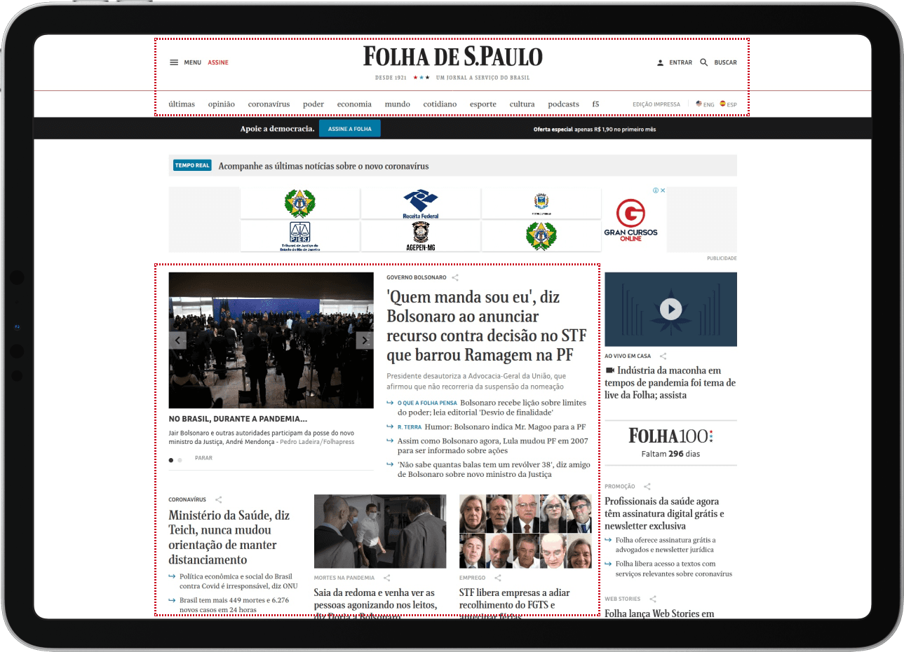
Working together, we identified that the Folha de São Paulo website, while functional, faced challenges with a cluttered layout, much like a traditional printed newspaper. This design approach led to an overwhelming amount of information presented simultaneously, complicating user navigation and decision-making.
Inneficient Menus
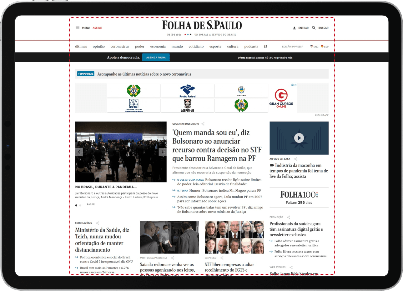
The homepage presents information in a confusing manner, attributed to an excess of menus and lack of proper categorization.
Cluttered Aesthetic
The aesthetic approach closely resembles a printed newspaper, failing to capitalize on the benefits and possibilities of a digital news platform.
Unflexibility
It was observed that on some screens, the excessive presence of menu bars and banners obscured the main content, which is the news.
Menu overload
The abundance of menus negatively impacted the site’s usability and navigation.
Unhelpful
Guidance
Elements intended to facilitate and guide the user were, in practice, creating obstacles and confusion.
Research and Analysis
Our analysis pinpointed key areas needing improvement, focusing on esthetics, flexibility, and user navigation. We observed that the website's design was overloaded with information, which led to decision fatigue among users. The layout didn’t fully utilize the advantages of a digital platform, with excessive menus and banners obscuring the main content.
Opportunities for Improvement
To enhance user experience, we proposed several improvements:
Streamlining the website's top section and reducing non-essential elements such as menus and large banners.
Effectively categorizing information to make it easier for users to find relevant news.
Leveraging the digital layout for user-friendly navigation and clear content presentation.
Final Solution
Home Page
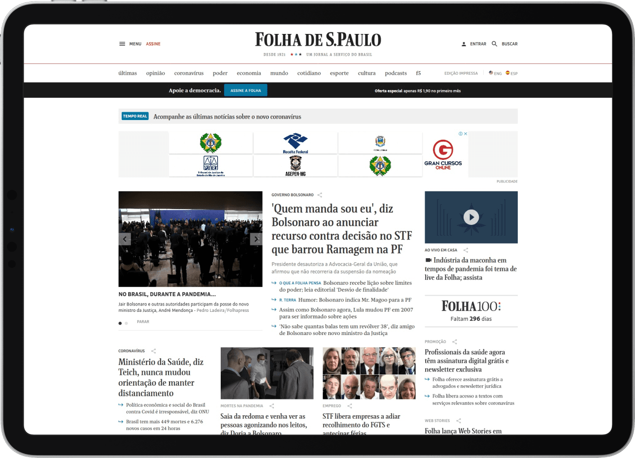
Before
Top Bars: Occupied a lot of space at the top.
Advertisement Banners: Larger and more prominent.
Layout: Consisted of many columns, reminiscent of a printed newspaper.
Text Density: High amount of text with little breathing space.
Home Page
After
Top Simplification: Cleaner and more streamlined top section.
Organized Categorization: Utilized menus for better organization of categories.
Smaller Advertisement Banners: Reduced the size of banners.
News Highlights: Greater emphasis on main news stories.
Layout Adjustment: Fewer columns with more space between them.
Home Page
After
Quick Overview: Quickly and simply displays current events in the country and the world.
News Prioritization: Highlights the most important news items.
Simplified Navigation: Navigation is easier and more straightforward.
User Engagement: Encourages users to click on news stories to read more details.
Article Page
Before
Top Element Size: Large top elements took up a lot of space, pushing the start of the content down, requiring extensive scrolling.
Article Page
Before
Left Column Space: Underutilized, offering limited value to the page layout.
Article Page
After
Increased Breathing Space: Expanded the area for content, allowing for a more relaxed reading experience.
Reduced Sidebar Clutter: Minimized the confusion caused by side elements.
Enhanced User Interaction: Added a 'Save' button and a reading list to strengthen onboarding and ongoing engagement. This encourages users to interact with the content for longer periods, resuming readings they couldn't finish or start.
Article Page
After
Footer Engagement: The footer invites users to explore the reading list. As they continue scrolling, the next article in the list opens automatically.
Results and Feedback
Our redesigned version of the Folha de São Paulo website received high praise from our teacher and classmates. It showcased the impact of thoughtful information design in enhancing user engagement and simplifying navigation.
Lessons Learned
Through this collaborative project, I learned the significance of clean, user-focused design in digital platforms and the balance between aesthetic appeal and functionality. It emphasized the importance of intuitive navigation in enhancing the user experience.
